Exploring pollution in a pandemic
You may remember the stories in the early pandemic months of 2020 telling us how persistent air pollution was clearing up as cities and countries went into lockdown. We heard about views of the Himalayas. Similarly, Los Angeles, notorious for air pollution, recorded its cleanest air in years. But things didn’t stay that way for long. I wanted to take a look at the air quality data for New York City, where I live, to see what insight I could glean. It was a strange summer in 2020, with a rise in car traffic, lots of grilling, lots of fireworks, and innumerable other small changes to the way that the city typically emits pollutants into the atmosphere.
I started by taking a trip to the EPA data website. The EPA operates air quality monitoring stations throughout the US, including multiple stations in NYC. They provide daily air quality data from these stations.
I’m going to walk through the analyses I did here at the end of this post, but all the data I gathered and the code to run these analyses (in R) can be found in this Github repository.
The short story is that things are weird.

Joy plot of pollutant concentrations by month. The distribution for each month describes the totality of daily measurements for that month. Light-colored curves are months during the pandemic. Darker curves are pre-pandemic.
At first glance, we can pick out some interesting insights from our joy plots.
Every summer we see an increase in PM 2.5 between July and August, a pattern that is not really mirrored in Carbon monoxide. There are a few possible explanations here, but one contributor might be fireworks. This seems especially reasonable given the large increase in summer 2020, when many industries were operating at lower capacity, but when fireworks were rampant in the city. In general however, it seems that there has been a slight easing of fine particulate pollution over the course of the pandemic. (Here the pandemic is colored with a lighter blue).
Nitrogen dioxide, which is a product of fossil fuel emissions, has been relatively steady over time, with a fairly predictable meander upwards each spring, potentially due to warming temperatures and atmospheric effects.
Of interest to our question here, of how the shutdown of the city has affected air quality, is the hard decline of Carbon monoxide in the early months of the pandemic. In April through September, CO levels appear to have been at some of their lowest concentrations in the last 5 years.
One way to think about this problem is to look at the concentrations in the month of April, since NYC was largely shuttered then. We can compare April 2020 to other Aprils.
The EPA data csvs come with a variety of data columns:

In these violin plots, the red plot is the pandemic April - 2020.
When viewed this way - comparing Aprils in different years, we can see that April 2020 showed some difference, but it’s not clear in each case whether that difference is substantially different enough from normal that we can think about attributing causation to it.
Below I walk through the full analysis, including some basic models and some data exploration.
In this example, I’m going to walk through an approach to looking at the question of whether the COVID shutdown in New York City had a measurable effect on air quality. In particular, I’ll look at 3 common pollutants - Carbon monoxide, Nitrogen dioxide, and fine particulate matter (PM 2.5) as recorded by EPA air quality monitoring stations.
First we’ll do some setup. Here I’ll load packages to help with data munging, visualization, and analysis.
# For reproducibility
set.seed(88)
# Load packages - Munging
library(dplyr)
library(lubridate)
# Visualization
library(ggplot2)
library(ggjoy)
library(wesanderson)
library(cowplot)
library(tidybayes)
# Analysis
library(R2jags)
library(rstanarm)
library(modelr)
We’ll import the data. EPA provides this in 1-year csv files, so we’ll have to combine them. The data are also available via the EPA API but, given the relatively small amount of data we want, in this case it’s easiest to just download individual files and combine them.
Here I’ll load in the csvs for each pollutant together, to end up with 3 data frames, one for each pollutant.
nyc_pm2_5.dat<-rbind(read.csv("data/NYNJ_PM2_5_EPA_2016.csv"),
                     read.csv("data/NYNJ_PM2_5_EPA_2017.csv"),
                     read.csv("data/NYNJ_PM2_5_EPA_2018.csv"),
                     read.csv("data/NYNJ_PM2_5_EPA_2019.csv"),
                     read.csv("data/NYNJ_PM2_5_EPA_2020.csv"),
                     read.csv("data/NYNJ_PM2_5_EPA_2021.csv"))

nyc_CO.dat<-rbind(read.csv("data/NYNJ_CO_EPA_2016.csv"),
                  read.csv("data/NYNJ_CO_EPA_2017.csv"),
                  read.csv("data/NYNJ_CO_EPA_2018.csv"),
                  read.csv("data/NYNJ_CO_EPA_2019.csv"),
                  read.csv("data/NYNJ_CO_EPA_2020.csv"),
                  read.csv("data/NYNJ_CO_EPA_2021.csv"))

nyc_NO2.dat<-rbind(read.csv("data/NYNJ_NO2_EPA_2016.csv"),
                   read.csv("data/NYNJ_NO2_EPA_2017.csv"),
                   read.csv("data/NYNJ_NO2_EPA_2018.csv"),
                   read.csv("data/NYNJ_NO2_EPA_2019.csv"),
                   read.csv("data/NYNJ_NO2_EPA_2020.csv"),
                   read.csv("data/NYNJ_NO2_EPA_2021.csv"))
names(nyc_pm2_5.dat)
##  [1] "Date"                           "Source"
##  [3] "Site.ID"                        "POC"
##  [5] "Daily.Mean.PM2.5.Concentration" "UNITS"
##  [7] "DAILY_AQI_VALUE"                "Site.Name"
##  [9] "DAILY_OBS_COUNT"                "PERCENT_COMPLETE"
## [11] "AQS_PARAMETER_CODE"             "AQS_PARAMETER_DESC"
## [13] "CBSA_CODE"                      "CBSA_NAME"
## [15] "STATE_CODE"                     "STATE"
## [17] "COUNTY_CODE"                    "COUNTY"
## [19] "SITE_LATITUDE"                  "SITE_LONGITUDE"
names(nyc_CO.dat)
##  [1] "Date"                              "Source"
##  [3] "Site.ID"                           "POC"
##  [5] "Daily.Max.8.hour.CO.Concentration" "UNITS"
##  [7] "DAILY_AQI_VALUE"                   "Site.Name"
##  [9] "DAILY_OBS_COUNT"                   "PERCENT_COMPLETE"
## [11] "AQS_PARAMETER_CODE"                "AQS_PARAMETER_DESC"
## [13] "CBSA_CODE"                         "CBSA_NAME"
## [15] "STATE_CODE"                        "STATE"
## [17] "COUNTY_CODE"                       "COUNTY"
## [19] "SITE_LATITUDE"                     "SITE_LONGITUDE"
names(nyc_NO2.dat)
##  [1] "Date"                               "Source"
##  [3] "Site.ID"                            "POC"
##  [5] "Daily.Max.1.hour.NO2.Concentration" "UNITS"
##  [7] "DAILY_AQI_VALUE"                    "Site.Name"
##  [9] "DAILY_OBS_COUNT"                    "PERCENT_COMPLETE"
## [11] "AQS_PARAMETER_CODE"                 "AQS_PARAMETER_DESC"
## [13] "CBSA_CODE"                          "CBSA_NAME"
## [15] "STATE_CODE"                         "STATE"
## [17] "COUNTY_CODE"                        "COUNTY"
## [19] "SITE_LATITUDE"                      "SITE_LONGITUDE"
Data Munging
The files we get are pollutant-specific, but fortunately nearly all the column names are the same - the only difference is the name of the measurement. They’re all some form of concentration, and the precise units are unimportant to us here. So we can simply relabel them each as “Concentration.” In this way, our columns are shared across the datasets, and we can fuse them. There are a few other tasks to accomplish. We’ll want some easier variables to work with than the full date, like the year and month, so we’ll create those here. We’ll also create a column called “Pandemic” which is a factor that describes whether the measurement was taken pre-pandemic (Normal) or during (Pandemic). We can also jettison the data for areas outside of NYC at this point. These might be interesting, but our particular question relates to NYC.
# Each data frame has a different column name for the measurement. We'll standardize
nyc_pm2_5.dat<-nyc_pm2_5.dat %>%
  rename(Concentration = Daily.Mean.PM2.5.Concentration)
nyc_CO.dat<-nyc_CO.dat %>%
  rename(Concentration=Daily.Max.8.hour.CO.Concentration)
nyc_NO2.dat<-nyc_NO2.dat %>%
  rename(Concentration=Daily.Max.1.hour.NO2.Concentration)

# now we can put them together
nyc.dat<-dplyr::bind_rows(nyc_pm2_5.dat,
                          nyc_CO.dat,
                          nyc_NO2.dat)

# translate date column into date objects
nyc.dat$Date<-lubridate::mdy(nyc.dat$Date)

# Date munging
nyc.dat$Year<-lubridate::year(nyc.dat$Date) # Add year column
nyc.dat$Month<-lubridate::month(nyc.dat$Date) # Add month column
nyc.dat$Day<-lubridate::yday(nyc.dat$Date) # Add day-of-year column
# It would be nice to plot everything chronologically, but still have factors as months.
# We can do this by creating a column that is a numeric representation of months
nyc.dat$RunningMonth<-as.numeric(nyc.dat$Year)+as.numeric(nyc.dat$Month)/13
# Then we make a more readable format
nyc.dat$RunningtextMonth<-paste(month(nyc.dat$Date, label = TRUE), nyc.dat$Year)
# And use the numeric format to re-order the readable format so we can plot with it
nyc.dat$RunningtextMonth<-reorder(nyc.dat$RunningtextMonth, nyc.dat$RunningMonth)
# Add a column to delimit the start of Covid in NYC
nyc.dat$Pandemic<-sapply(nyc.dat$RunningMonth,
                         FUN=function(x) ifelse(x < 2020.3,
                                                "Normal",
                                                "Pandemic"))

# We'll make a little vector of the pollutant names to help us along
pol_types<-unique(nyc.dat$AQS_PARAMETER_DESC)

# The data are for the wider NYC area including NJ and Long Island
# We'll pull only the relevant counties

nyc.dat<-dplyr::filter(nyc.dat, COUNTY %in% c("Kings",
                                              "Queens",
                                              "Bronx",
                                              "New York",
                                              "Richmond"),
                       AQS_PARAMETER_DESC %in% pol_types[c(1,3:4)])
Preliminary Visualization
We can visualize the data with a simple scatterplot over time to see how concentration changes. We’ll set colors based on borough/county in NYC. But it turns out that this is misleading, since a dip in 2020 is actually due to a lack of readings for some pollutants.
ggplot(data=nyc.dat[nyc.dat$Year > 2017 &
                    nyc.dat$AQS_PARAMETER_DESC == "PM2.5 - Local Conditions",],
                  aes(x=Day,
                      y=Concentration))+
  geom_jitter(aes(color=COUNTY),
              alpha = 0.2,
              height = 0.03)+
  theme_minimal()+
  labs(x = "Day of the Year")+
  ggtitle("PM 2.5")+
  facet_wrap(~Year)

Joy Plots
Joy plots can help us understand the change over time, visualized in a really rich plot that looks like a ridgeline. I’ll make a joy plot for each pollutant and we can look at them together over time.
# PM 2.5 Plot
joy.pm25<-ggplot(nyc.dat[nyc.dat$AQS_PARAMETER_DESC == pol_types[1],],
                 aes(x = Concentration,
                     y = factor(RunningtextMonth)))+
  geom_joy(scale = 3,
           alpha = 0.95,
           size = 1,
           aes(fill = Pandemic,
               color = Pandemic))+
  labs(x = "")+
  lims(x = c(-5,25))+
  ggtitle("PM 2.5")+
  scale_color_manual(values = wes_palette("Zissou1")[c(2,1)])+
  scale_fill_manual(values = wes_palette("Zissou1")[c(1,2)])+
  scale_y_discrete(breaks = levels(nyc.dat$RunningtextMonth)[c(T,F)])+
  theme_minimal()+
  theme(legend.position = "None",
        axis.title.y = element_blank())

# Carbon monoxide plot
joy.CO<-ggplot(nyc.dat[nyc.dat$AQS_PARAMETER_DESC == pol_types[3],],
               aes(x = Concentration,
                   y = factor(RunningtextMonth)))+
  geom_joy(scale = 3,
           alpha = 0.95,
           size = 1,
           aes(fill = Pandemic,
               color = Pandemic))+
  labs(x = "Concentration", y = "")+
  lims(x = c(0,1))+
  ggtitle(pol_types[3])+
  scale_color_manual(values = wes_palette("Zissou1")[c(2,1)])+
  scale_fill_manual(values = wes_palette("Zissou1")[c(1,2)])+
  theme_minimal()+
  theme(legend.position = "None",
        axis.text.y = element_blank(),
        axis.title.y = element_blank())

# Nitrogen dioxide plot
joy.NO2<-ggplot(nyc.dat[nyc.dat$AQS_PARAMETER_DESC == pol_types[4],],
                aes(x = Concentration,
                    y = factor(RunningtextMonth)))+
  geom_joy(scale = 3,
           alpha = 0.95,
           size = 1,
           aes(fill = Pandemic,
               color = Pandemic))+
  labs(x = "", y = "")+
  lims(x = c(-5,75))+
  ggtitle("Nitrogen dioxide")+
  scale_color_manual(values = wes_palette("Zissou1")[c(2,1)])+
  scale_fill_manual( values = wes_palette("Zissou1")[c(1,2)])+
  theme_minimal()+
  theme(legend.position = "None",
        axis.title.y = element_blank(),
        axis.text.y  = element_blank())

# Combine plots
cowplot::plot_grid(joy.pm25,
                   joy.CO,
                   joy.NO2,
                   ncol = 3,
                   rel_widths = c(0.38,0.31,0.31))

At first glance, we can pick out some interesting insights from our joy plots.
Every summer we see an increase in PM 2.5 between July and August, a pattern that is not really mirrored in Carbon monoxide. There are a few possible explanations here, but one contributor might be fireworks. This seems especially reasonable given the large increase in summer 2020, when many industries were operating at lower capacity, but when fireworks were rampant in the city. In general however, it seems that there has been a slight easing of fine particulate pollution over the course of the pandemic. (Here the pandemic is colored with a lighter blue).
Nitrogen dioxide, which is a product of fossil fuel emissions, has been relatively steady over time, with a fairly predictable meander upwards each spring, potentially due to warming temperatures and atmospheric effects.
Of interest to our question here, of how the shutdown of the city has affected air quality, is the hard decline of Carbon monoxide in the early months of the pandemic. In April through September, CO levels appear to have been at some of their lowest concentrations in the last 5 years.
To gain an overall sense of the change, we can use the EPA’s Air Quality Index statistic in another joy plot:
ggplot(data = nyc.dat,
       aes(x = DAILY_AQI_VALUE,
           y = RunningtextMonth))+
  geom_joy(scale = 4,
           alpha = 0.95,
           size = 1,
           aes(fill = Pandemic,
               color = Pandemic))+
  lims(x = c(-10, 90))+
  labs(x = "Air Quality Index")+
  theme_minimal()+
  theme(axis.title.y = element_blank(),
        legend.position = "None")+
  ggtitle("EPA Air Quality - NYC")+
  scale_color_manual(values = wes_palette("Zissou1")[c(2,1)])+
  scale_fill_manual( values = wes_palette("Zissou1")[c(1,2)])+
  scale_y_discrete(breaks = levels(nyc.dat$RunningtextMonth)[c(T,F)])

The AQI, calculated by the EPA, is not an ideal statistic to be visualized this way, since it operates on a discrete scale. In our joy plot, you can see the bump at low levels get smoothed.
ggplot(data = nyc.dat,
       aes(x = Date,
           y = DAILY_AQI_VALUE))+
  geom_jitter(aes(color = Pandemic),
              height = 0.25,
              alpha = 0.2)+
  theme_minimal()+
  labs(y = "Daily Air Quality Index")

When we just plot out the AQI as a scatterplot, we see a big dip right at the beginning of the “Pause” in NYC. But it’s not clear if this is driven by actual changes in air quality, or missing data.
ggplot(data = nyc.dat[nyc.dat$Year > 2018,],
              aes(x = Date,
                  y = DAILY_AQI_VALUE))+
  geom_jitter(aes(color = Pandemic),
              height = 0.25,
              alpha = 0.2)+
  theme_minimal()+
  theme(axis.text.x = element_text(angle=35, hjust = 1))+
  labs(y = "Daily Air Quality Index",
       x = "")+
  facet_wrap(~COUNTY)

When we compare boroughs side-by-side for 2019 and 2020, we can see where the data are sparse, and where they remain good. Manhattan for example (New York County) seems less dense. But is that just because the air quality dramatically improved as office workers stayed home, and thus all the points are clustered at the bottom?
ggplot(data=nyc.dat[nyc.dat$Year == 2020,],
       aes(month(Month, label = T)))+
  geom_bar(aes(fill = COUNTY))+
  theme_minimal()+
  theme(axis.text.x = element_text(angle = 45))+
  ggtitle("2020")+
  labs(x = "Month",
       y = "No. of Measurements")+
  scale_fill_manual(values = wes_palette("Darjeeling1",
                                       type = "discrete")[c(2,3,1,4,5)])+
  facet_wrap(~AQS_PARAMETER_DESC)

Broken down a little more explicitly, we see that there are no measurements of Nitrogen dioxide anywhere but the Bronx and Queens in 2020. For local PM 2.5, at the beginning of the shutdown, no measurements come from Staten Island (Richmond), Manhattan (New York), or Brooklyn (Kings), though all return by August. For CO, no measurements come from Staten Island and Brooklyn, but other boroughs have consistent measurements.
So if our interest is in understanding pandemic-related changes in air quality, we should stick to those boroughs with consistent data. The Bronx and Queens are both reliable here throughout, and Manhattan can help us understand Carbon monoxide as well.
Modelling air quality during covid
Given the degree of change in behavior of residents in late March through early May, it seems simplest to focus on that period to ask our most basic question of whether the pandemic had a meaningful effect on these pollutants.
So we’ll start by working up a simple linear model, implemented here in a Bayesian framework with Stan, comparing the concentration of pollutants over the course of 2019 through mid-2020.
# Build out our linear model for each pollutant
CO_lm.stan<-stan_lm(data = filter(nyc.dat,
                   COUNTY %in% c("Bronx",
                                 "New York",
                                 "Queens"),
                   AQS_PARAMETER_DESC %in% "Carbon monoxide",
                   RunningMonth > 2019,
                   RunningMonth < 2020.7),
                   Concentration~Date,
                   prior = R2(0.5, 'mean'))
NO2_lm.stan<-stan_lm(data = filter(nyc.dat,
                   COUNTY %in% c("Bronx",
                                 "Queens"),
                   AQS_PARAMETER_DESC %in% "Nitrogen dioxide (NO2)",
                   RunningMonth > 2019,
                   RunningMonth < 2020.7),
                   Concentration~Date,
                   prior = R2(0.5, 'mean'))
PM2_5_lm.stan<-stan_lm(data = filter(nyc.dat,
                   COUNTY %in% c("Bronx",
                                 "Queens"),
                   AQS_PARAMETER_DESC %in% "PM2.5 - Local Conditions",
                   RunningMonth > 2019,
                   RunningMonth < 2020.7),
                   Concentration~Date,
                   prior = R2(0.5, 'mean'))

# Plot posterior draws and credible intervals on the data
CO_lm.plot<-filter(nyc.dat,
                   COUNTY %in% c("Bronx",
                                 "New York",
                                 "Queens"),
                   AQS_PARAMETER_DESC %in% "Carbon monoxide",
                   RunningMonth > 2019,
                   RunningMonth < 2020.7) %>%
  data_grid(Date = seq_range(Date, n = 10),
            Concentration = seq_range(Concentration,by = 0.1)) %>%
  add_fitted_draws(CO_lm.stan,
                   n = 100) %>%
  ggplot(aes(x = Date, y = Concentration))+
    geom_jitter(data = filter(nyc.dat,
                     COUNTY %in% c("Bronx",
                                   "New York",
                                   "Queens"),
                     AQS_PARAMETER_DESC %in% "Carbon monoxide",
                     Year > 2018,
                     RunningMonth < 2020.7),
               alpha = 0.4,
               height = 0.1,
               aes(color = COUNTY))+
    stat_lineribbon(aes(y = .value),
                    .width = c(0.8, 0.95),
                    alpha = 0.5)+
    theme_minimal()+
    theme(axis.text.x = element_text(angle = 45))+
    ggtitle("Carbon monoxide")+
    scale_fill_manual(values = wes_palette("GrandBudapest2")[c(2,4)],
                      name = "Credible Interval",
                      labels = c("95%", "80%"))+
    labs(x = "",
         y = "")+
    scale_color_manual(name = "County",
                       values = wes_palette("FantasticFox1")[c(1:3,5)])

NO2_lm.plot<-filter(nyc.dat,
                   COUNTY %in% c("Bronx",
                                 "Queens"),
                   AQS_PARAMETER_DESC %in% "Nitrogen dioxide (NO2)",
                   RunningMonth > 2019,
                   RunningMonth < 2020.7) %>%
  data_grid(Date = seq_range(Date, n = 10),
            Concentration = seq_range(Concentration,
                                    by = 0.1)) %>%
  add_fitted_draws(NO2_lm.stan,
                   n = 100) %>%
  ggplot(aes(x = Date,
             y = Concentration))+
    geom_jitter(data = filter(nyc.dat,
                     COUNTY %in% c("Bronx",
                                   "Queens"),
                     AQS_PARAMETER_DESC %in% "Nitrogen dioxide (NO2)",
                     Year > 2018,
                     RunningMonth < 2020.7),
               alpha = 0.4,
               height = 0.1,
               aes(color = COUNTY))+
    stat_lineribbon(aes(y = .value),
                    .width = c(0.8, 0.95),
                    alpha = 0.5)+
    theme_minimal()+
    theme(legend.position = "None",
          axis.text.x = element_text(angle = 45))+
    ggtitle("Nitrogen dioxide")+
    scale_fill_manual(values = wes_palette("GrandBudapest2")[c(2,4)],
                      name = "Credible Interval",
                      labels = c("95%", "80%"))+
    labs(x = " ",
         y = "")+
    scale_color_manual(name = "County",
                       values = wes_palette("FantasticFox1")[c(1:3,5)])

PM2_5_lm.plot<-filter(nyc.dat,
                      COUNTY %in% c("Bronx",
                                    "Queens"),
                      AQS_PARAMETER_DESC %in% "PM2.5 - Local Conditions",
                      RunningMonth > 2019,
                      RunningMonth < 2020.7) %>%
  data_grid(Date = seq_range(Date, n = 10),
            Concentration = seq_range(Concentration,
                                    by = 0.1)) %>%
  add_fitted_draws(PM2_5_lm.stan,
                   n = 100) %>%
  ggplot(aes(x = Date,
             y = Concentration))+
    geom_jitter(data = filter(nyc.dat,
                   COUNTY %in% c("Bronx",
                                 "Queens"),
                   AQS_PARAMETER_DESC %in% "PM2.5 - Local Conditions",
                   Year > 2018,
                   RunningMonth < 2020.7),
             alpha = 0.4,
             height = 0.1,
             aes(color = COUNTY))+
    geom_jitter(data = filter(nyc.dat,
                   COUNTY %in% c("Bronx",
                                 "Queens"),
                   AQS_PARAMETER_DESC %in% "PM2.5 - Local Conditions",
                   Year > 2018,
                   RunningMonth < 2020.7),
                alpha = 0.4,
                height = 0.1,
                aes(color = COUNTY))+
    stat_lineribbon(aes(y = .value),
                    .width = c(0.8, 0.95),
                    alpha = 0.5)+
    theme_minimal()+
    theme(legend.position = "None",
          axis.text.x = element_text(angle = 45))+
    scale_fill_manual(values = wes_palette("GrandBudapest2")[c(2,4)],
                      name = "Credible Interval",
                      labels = c("95%", "80%"))+
    scale_color_manual(name = "County",
                       values = wes_palette("FantasticFox1")[c(1:3,5)])+
    labs(x = "",
         y = "Concentration")+
    ggtitle("PM 2.5")

cowplot::plot_grid(PM2_5_lm.plot,
                   NO2_lm.plot,
                   CO_lm.plot,
                   ncol = 3,
                   rel_widths = c(1,1,2.1))
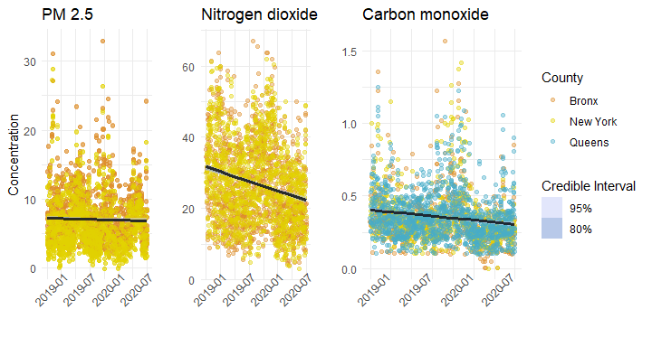
There isn’t much evidence for a decline in PM2.5, but somewhat more compelling evidence for NO2. We can take a closer look at the estimates:
summary(NO2_lm.stan)

##
## Model Info:
##  function:     stan_lm
##  family:       gaussian [identity]
##  formula:      Concentration ~ Date
##  algorithm:    sampling
##  sample:       4000 (posterior sample size)
##  priors:       see help('prior_summary')
##  observations: 2465
##  predictors:   2
##
## Estimates:
##                 mean   sd    10%   50%   90%
## (Intercept)   293.7   23.1 263.9 294.1 323.0
## Date            0.0    0.0   0.0   0.0   0.0
## sigma          11.3    0.2  11.1  11.3  11.5
## log-fit_ratio  -0.1    0.0  -0.2  -0.1  -0.1
## R2              0.1    0.0   0.1   0.1   0.1
##
## Fit Diagnostics:
##            mean   sd   10%   50%   90%
## mean_PPD 27.0    0.3 26.5  27.0  27.4
##
## The mean_ppd is the sample average posterior predictive distribution of the outcome variable (for details see help('summary.stanreg')).
##
## MCMC diagnostics
##               mcse Rhat n_eff
## (Intercept)   0.9  1.0   671
## Date          0.0  1.0   671
## sigma         0.0  1.0  1064
## log-fit_ratio 0.0  1.0   698
## R2            0.0  1.0   605
## mean_PPD      0.0  1.0  3765
## log-posterior 0.1  1.0   533
##
## For each parameter, mcse is Monte Carlo standard error, n_eff is a crude measure of effective sample size, and Rhat is the potential scale reduction factor on split chains (at convergence Rhat=1).

NO2_lm.stan$coefficients

##  (Intercept)         Date
## 294.07867583  -0.01465859
Here in the case of our NO2 model, the slightly negative log-fit ratio indicates a good fit.
But a simple linear model here is not necessarily the best way to look at these data. Just on the side of the data, there is some heteroskedacity that we might be concerned about. But more importantly, a linear model does not match our actual hypothesis, which is that the pandemic shutdown would have a noticeable effect. A linear model would be better at determining whether there had been a steady decline since the beginning of 2019, but that is not our hypothesis. What we really want to test is whether the “intervention” of the pandemic changed air pollutant concentrations.
To do that, we can look across the various months of April, for example, and see whether April 2020 exceeds the normal variance you’d expect between years.
# Carbon monoxide
CO_violin.plot<-ggplot(data=nyc.dat[nyc.dat$Month == 4 &
                                    nyc.dat$Year < 2021 &
                                    nyc.dat$AQS_PARAMETER_DESC == "Carbon monoxide",])+
  geom_violin(aes(x = factor(Year),
                  y = Concentration,
                  fill = Pandemic))+
  geom_jitter(aes(x = factor(Year),
                  y = Concentration,
                  color = Pandemic),
              width = 0.1,
              alpha = 0.5)+
  theme_minimal()+
  theme(axis.title.y = element_blank(),
        legend.position = "None")+
  labs(x = "Carbon monoxide")+
  ggtitle("")+
  scale_fill_manual(values = wes_palette("Darjeeling1")[c(5,1)])+
  scale_color_manual(values = wes_palette("Zissou1")[c(3,4)])

# Nitrogen dioxide
NO2_violin.plot<-ggplot(data = nyc.dat[nyc.dat$Month == 4 &
                    nyc.dat$Year < 2021 &
                    nyc.dat$AQS_PARAMETER_DESC == "Nitrogen dioxide (NO2)",])+
  geom_violin(aes(x = factor(Year),
                  y = Concentration,
                  fill = Pandemic))+
  geom_jitter(aes(x = factor(Year),
                  y = Concentration,
                  color = Pandemic),
              width = 0.1,
              alpha = 0.5)+
  theme_minimal()+
  theme(axis.title.y = element_blank(),
        legend.position = "None")+
  labs(x = "Nitrogen dioxide")+
  ggtitle("")+
  scale_fill_manual(values = wes_palette("Darjeeling1")[c(5,1)])+
  scale_color_manual(values = wes_palette("Zissou1")[c(3,4)])

# PM 2.5
PM2_5_violin.plot<-ggplot(data = nyc.dat[nyc.dat$Month == 4 &
                    nyc.dat$Year < 2021 &
                    nyc.dat$AQS_PARAMETER_DESC == "PM2.5 - Local Conditions",])+
  geom_violin(aes(x = factor(Year),
                  y = Concentration,
                  fill = Pandemic))+
  geom_jitter(aes(x = factor(Year),
                  y = Concentration,
                  color = Pandemic),
              width = 0.1,
              alpha = 0.5)+
  theme_minimal()+
  theme(legend.position = "None")+
  ggtitle("April Concentrations")+
  labs(x = "PM 2.5")+
  scale_fill_manual(values = wes_palette("Darjeeling1")[c(5,1)])+
  scale_color_manual(values = wes_palette("Zissou1")[c(3,4)])

# Plot together
cowplot::plot_grid(PM2_5_violin.plot,
                   NO2_violin.plot,
                   CO_violin.plot,
                   ncol = 3,
                   rel_widths = c(0.33, 0.33, 0.33))

When viewed this way - comparing Aprils in different years, we can see that April 2020 showed some difference, but it’s not clear in each case whether that difference is substantially different enough from normal that we can think about attributing causation to it. So to answer the question that we’re interested in, we can either do a t-test in a frequentist framework, or a similar approach in a Bayesian framework.
Rather than using Stan here, I’ll implement this model in JAGS, which requires more explicit description of the model. JAGS and RMarkdown don’t get along when creating models, so the model parameterization file is included separately and called here to evaluate.
Now we’ve run the model, and we can have a look at the posterior estimates. In particular here, we’re interested in the estimate for Beta, which is our slope in a linear context. Negative values will tell us that there’s a negative relationship (i.e., that April 2020 did go down) and positive values the opposite.
# Now we can work with the model output

g_df<-as.data.frame(g$BUGSoutput$sims.matrix)

# First we'll record the credible intervals

b_CI<-data.frame(Pollutant = c("CO","CO","NO2","NO2", "PM2.5", "PM2.5"),
                 CI = c(quantile(g_df$beta_CO, 0.025),
                        quantile(g_df$beta_CO, 0.975),
                        quantile(g_df$beta_NO2, 0.025),
                        quantile(g_df$beta_NO2, 0.975),
                        quantile(g_df$beta_PM2_5, 0.025),
                        quantile(g_df$beta_PM2_5, 0.975)),
                 Type = c("Lower","Upper","Lower","Upper","Lower","Upper"))

# And then make a new dataframe in which we record all the
# posterior estimates that fall within the CIs
bCIarea<-data.frame(beta_CO = g_df$beta_CO[g_df$beta_CO > b_CI$CI[1] &
                                           g_df$beta_CO < b_CI$CI[2]],
                    beta_NO2 = g_df$beta_NO2[g_df$beta_NO2 > b_CI$CI[3] &
                                             g_df$beta_NO2 < b_CI$CI[4]],
                    beta_PM2_5 = g_df$beta_PM2_5[g_df$beta_PM2_5 > b_CI$CI[5] &
                                                 g_df$beta_PM2_5 < b_CI$CI[6]])

# And then we can plot the posterior estimates for our beta parameter
CO_beta.plot<-ggplot(data = g_df,
                     aes(x = beta_CO))+
  geom_density(fill = wes_palette("GrandBudapest2")[1],
               color = wes_palette("GrandBudapest2")[1])+
  geom_density(data = bCIarea,
               fill = wes_palette("GrandBudapest2")[2],
               color = wes_palette("GrandBudapest2")[2])+
  theme_minimal()+
  theme(axis.title.y = element_blank())+
  labs(x = "Beta CO")+
  ggtitle(" ")
NO2_beta.plot<-ggplot(data = g_df,
                      aes(x = beta_NO2))+
  geom_density(fill = wes_palette("GrandBudapest2")[1],
               color = wes_palette("GrandBudapest2")[1])+
  geom_density(data = bCIarea,
               fill = wes_palette("GrandBudapest2")[2],
               color = wes_palette("GrandBudapest2")[2])+
  theme_minimal()+
  theme(axis.title.y = element_blank())+
  labs(x = "Beta NO2")+
  ggtitle(" ")
PM2_5_beta.plot<-ggplot(data = g_df,
                        aes(x = beta_PM2_5))+
  geom_density(fill = wes_palette("GrandBudapest2")[1],
               color = wes_palette("GrandBudapest2")[1])+
  geom_density(data = bCIarea,
               fill = wes_palette("GrandBudapest2")[2],
               color = wes_palette("GrandBudapest2")[2])+
  theme_minimal()+
  labs(x = "Beta PM 2.5",
       y = "Density")+
  ggtitle("Posterior estimates, Beta")

# Plot together
cowplot::plot_grid(PM2_5_beta.plot,
                   NO2_beta.plot,
                   CO_beta.plot,
                   ncol = 3,
                   rel_widths = c(0.33, 0.33, 0.33))

# Table for CIs
knitr::kable(b_CI, caption = "95% Credible Intervals")
95% Credible Intervals
Pollutant   CI  Type
CO  -0.1166686  Lower
CO  -0.0678272  Upper
NO2 -12.1731875 Lower
NO2 -6.9667455  Upper
PM2.5 -1.4556021 Lower
PM2.5 0.3466315  Upper
Based on our posterior estimates of Beta here, we can see that for PM 2.5, our 95% credible intervals overlap substantially with 0. Areas outside the credible intervals here are pink, while those within are blue. In Bayesian paradigm, this essentially means that there was no significant difference between Aprils prior to Covid and April 2020.
On the other hand, both NO2 and CO show significant drops in concentration for that April.
So at this point, we’ve assessed that concentrations were unusually low in April 2020 for two of our pollutants. Our next step, attempting to understand the causes of this drop, requires more particular knowledge of the typical sources of CO and NO2 in the city. A variety of publicly-available data, including data from the City of New York could help here, but the craft of determining plausible explanations is not always served by merely data-mining as many potential covariates as possible. As previously mentioned, fireworks may have played a role in the lack of a drop in PM 2.5, but the specifics of emissions of each pollutant require a better understanding of systems involved.
Without exploring the potential atmospheric science involved here, we can still compare to other large cities to get a sense for the patter at a larger scale.
I’ve pulled in data from the EPA’s monitoring stations in Seattle as well. I’ll omit the code as it’s the duplicate of what we’ve done above (but is available in the .RMD), and we can have a look at the comparison with our joy plots again.
# PM 2.5 Plot
SEA_joy.pm25<-ggplot(SEA.dat[SEA.dat$AQS_PARAMETER_DESC == pol_types[1],],
                 aes(x = Concentration,
                     y = factor(RunningtextMonth)))+
  geom_joy(scale = 3,
           alpha = 0.95,
           size = 1,
           aes(fill = Pandemic,
               color = Pandemic))+
  labs(x = "")+
  lims(x = c(-5,25))+
  ggtitle("PM 2.5")+
  scale_color_manual(values = wes_palette("Zissou1")[c(2,1)])+
  scale_fill_manual(values = wes_palette("Zissou1")[c(1,2)])+
  scale_y_discrete(breaks = levels(nyc.dat$RunningtextMonth)[c(T,F)])+
  theme_minimal()+
  theme(legend.position = "None",
        axis.title.y = element_blank())

# Carbon monoxide plot
SEA_joy.CO<-ggplot(SEA.dat[SEA.dat$AQS_PARAMETER_DESC == pol_types[3],],
               aes(x = Concentration,
                   y = factor(RunningtextMonth)))+
  geom_joy(scale = 3,
           alpha = 0.95,
           size = 1,
           aes(fill = Pandemic,
               color = Pandemic))+
  labs(x = " ",
       y = "")+
  lims(x = c(0,1))+
  ggtitle(pol_types[3])+
  scale_color_manual(values = wes_palette("Zissou1")[c(2,1)])+
  scale_fill_manual(values = wes_palette("Zissou1")[c(1,2)])+
  theme_minimal()+
  theme(legend.position = "None",
        axis.text.y = element_blank(),
        axis.title.y = element_blank())

# Nitrogen dioxide plot
SEA_joy.NO2<-ggplot(SEA.dat[SEA.dat$AQS_PARAMETER_DESC == pol_types[4],],
                aes(x = Concentration,
                    y = factor(RunningtextMonth)))+
  geom_joy(scale = 3,
           alpha = 0.95,
           size = 1,
           aes(fill = Pandemic,
               color = Pandemic))+
  labs(x = "",
       y = "")+
  lims(x = c(-5,75))+
  ggtitle("Nitrogen dioxide")+
  scale_color_manual(values = wes_palette("Zissou1")[c(2,1)])+
  scale_fill_manual( values = wes_palette("Zissou1")[c(1,2)])+
  theme_minimal()+
  theme(legend.position = "None",
        axis.title.y = element_blank(),
        axis.text.y  = element_blank())

# Combine plots - NYC + SEA
cowplot::plot_grid(joy.pm25+ggtitle("PM2.5 - NYC"),
                   SEA_joy.pm25+ggtitle("SEA")+
                     theme(axis.text.y = element_blank()),
                   joy.CO+ggtitle("CO - NYC"),
                   SEA_joy.CO+ggtitle("SEA"),
                   joy.NO2+ggtitle("NO2 - NYC"),
                   SEA_joy.NO2+ggtitle("SEA"),
                   ncol = 6,
                   rel_widths = c(1.4,1,1,1,1,1))
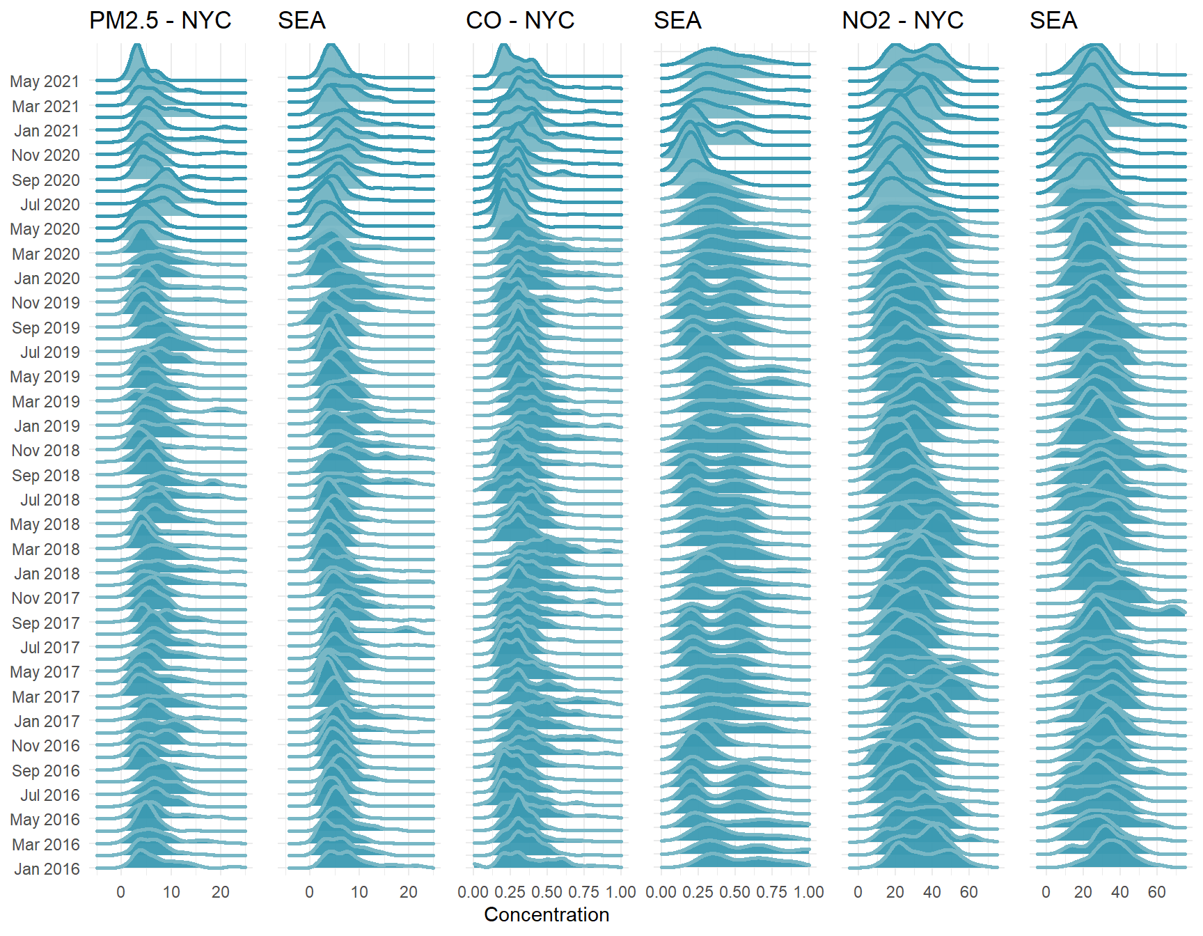
At a broad scale, we see similar patterns. A decline in spring that includes some of the lowest readings recorded of PM2.5 and CO. Perhaps more interesting however, and certainly more noticeable now that we’re looking across two cities, is the decrease in variance for each pollutant as the pandemic shutdown begins. The Seattle area more than NYC has quite variable readings in each month, with broad distributions, but as shutdown begins (March 23 in Seattle), distribution flattens quite a bit. In the model we produced before, we were primarily interested in the mean value for April in each year, but we could also model the variance as well in a hierarchical modelling framework.
Exploring a dataset such as this means understanding the nature of the data it contains - what does each variable mean?, how are observations collected?, where is there independence or not? However there must always be a stage in which creating a useful model relies on domain expertise and conversations with the relevant experts. In this case I would be wary to go much farther without bringing in an atmospheric scientist and having discussions with those who pay attention to drivers of pollutant concentration.
Download the files at Github